How to Choose the Right Channel Letter Size for Your Business Sign
A restaurant owner called me a few years back, furious. He had just spent close to 4,000 dollars on a beautiful set of channel letters, and from the road, you could barely tell his restaurant had a sign at all. The letters looked great up close. From the highway exit ramp 200 feet away, where most of his customers were actually driving past, they read as a blur.
Nobody had asked him how far away people needed to read his sign from. The shop that sold it to him matched the letter height to what looked proportional against his building, not to what would actually be legible from where his customers were coming from. That one detail cost him a second sign order within a year.
Letter size is the single most under-discussed part of ordering a channel letter sign, and it is also the easiest thing to get wrong. This guide walks through exactly how to size your sign correctly the first time, using the same math sign professionals use every day.
Why Letter Size Matters More Than People Think
Most business owners focus on font, color, and lighting style when planning a sign, and those choices matter. But none of it matters if the letters are too small to read from where people actually see your building.
A sign that is technically installed but functionally invisible is not decoration, it is a wasted expense. Getting the size right the first time is cheaper than any amount of rebranding or redesign after the fact.
Think about how you actually notice signs yourself. You are rarely standing still, staring directly at a storefront from a comfortable reading distance. You are driving past at 35 miles per hour, or walking while checking your phone, or glancing over from across a parking lot. Sign sizing has to account for that reality, not the idealized version of a customer calmly reading your name up close.
This is also where a lot of money quietly gets wasted in the sign industry. Business owners spend on premium finishes, custom fonts, and elaborate lighting effects, then undersize the actual letters because nobody framed the decision around viewing distance in the first place.
The Basic Rule: Viewing Distance and Letter Height
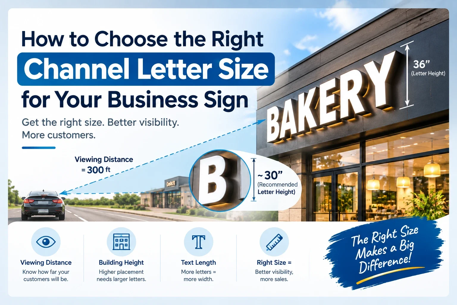
The sign industry works off a simple rule of thumb that has held up for decades. For roughly every 10 feet of viewing distance, you need about 1 inch of letter height for comfortable readability, with an additional buffer for the maximum distance at which the sign still grabs attention.
The 10-Foot-Per-Inch Rule
This baseline, commonly cited across the sign industry including by Signs.com, means a sign meant to be read from 100 feet away needs letters around 10 inches tall. A sign meant to be read from 300 feet, such as one visible from a highway, needs letters closer to 30 inches.
| Letter Height | Readable Distance | Maximum Impact Distance |
|---|---|---|
| 3 inches | 30 feet | 10 feet |
| 6 inches | 60 feet | 20 feet |
| 9 inches | 90 feet | 30 feet |
| 12 inches | 120 feet | 40 feet |
| 18 inches | 180 feet | 60 feet |
| 24 inches | 240 feet | 80 feet |
| 36 inches | 360 feet | 100 feet |
The “maximum impact distance” column matters as much as the readable distance. That is the range at which your sign does more than just get read, it actually catches attention and pulls someone’s eye toward your storefront.
How Building Height and Mounting Position Affect Size
Viewing distance is not the only variable. Where your sign sits on the building changes how big it needs to be, independent of how far away people are standing.
A sign mounted high on a two or three story facade needs to be larger than the distance chart alone would suggest, since the vertical angle makes text harder to read even at a closer horizontal distance. A sign mounted at eye level, like interior lobby signage, can run smaller than the chart suggests because there is no angle correction needed.
If your storefront sits behind parking, landscaping, or other obstructions that increase the effective distance between the sign and the road, size up rather than sizing to the raw straight-line distance.
How Text Length Changes Your Sign Size
Letter height tells you how tall your letters should be, but total sign width depends on how many characters you are fitting into that height. A five letter name and a fifteen letter name at the same letter height will need very different total widths, and very different available wall space.
This is exactly why we built a commercial sign size visualizer into our front-lit channel letter page. Enter your installation height and approximate text length, and it estimates a realistic sign width scaled against a person standing at the storefront, so you are not guessing at proportions before you order.
If your business name is long, you may need to either reduce letter height slightly to fit your available wall space, or consider a light box format instead, which handles longer names more efficiently than individual channel letters. Our channel letters vs light box comparison guide breaks down that decision in more detail.
Letter Height by Business Type
Different business types have different practical sizing needs based on how and where customers encounter them.
| Business Type | Typical Viewing Distance | Recommended Letter Height |
|---|---|---|
| Mall interior storefront | 20 to 50 feet | 6 to 10 inches |
| Strip mall retail shop | 50 to 150 feet | 10 to 18 inches |
| Standalone restaurant | 100 to 250 feet | 15 to 24 inches |
| Highway-visible retail | 250 to 500 feet | 24 to 36 inches |
| Corporate lobby wall | 10 to 30 feet | 4 to 8 inches |
These ranges are starting points, not hard rules. A business on a busy urban sidewalk with slow foot traffic can size smaller than these numbers suggest, since people are walking, not driving past at 40 miles per hour.
Common Sizing Mistakes That Hurt Visibility
The most common mistake is sizing a sign to look proportional against the building rather than sizing it for the actual viewing distance. A sign can look perfectly balanced in a photo and still be too small to read from the street.
Another frequent mistake is ignoring font weight. A thin, decorative script font needs to be noticeably larger than a bold sans-serif font to achieve the same readability at a given distance, since thin strokes lose definition faster with distance and motion.
Color contrast gets overlooked just as often. A white letter on a light-colored building, or a dark letter on a dark brick facade, can technically be the right size and still fail to read clearly because there is not enough contrast against the background.
A fourth mistake worth naming is sizing based on a single reference point instead of the full range of angles people actually approach from. A sign that reads perfectly from a straight-on approach can lose most of its legibility when viewed from a sharp angle coming off a side street, which is often the most common approach for businesses near an intersection. Walking or driving the actual approach routes to your building before finalizing a size catches this problem before it becomes permanent.
How Local Sign Codes Limit Your Letter Height
Before finalizing any size, check your local sign code. Most cities cap maximum letter height and total sign square footage based on zoning district, road classification, and sometimes the width of your storefront frontage.
It is common for a business to want a 36 inch letter height based on visibility needs, only to find their zoning district caps signage at 24 inches. Getting this answer before you order avoids a redesign after the fact. Our business sign permit guide walks through how to find your local code and what documentation most cities require during the permit process.
How Lighting Affects Perceived Size
A sizing detail that rarely comes up until after installation is that illuminated letters read as larger than their physical dimensions once lit, especially at night against a dark sky or unlit facade. This is a genuine optical effect, not just a subjective impression, caused by the glow spreading slightly beyond the hard edge of the letter itself.
This means a sign sized correctly for daytime readability sometimes feels oversized at night, and a sign sized conservatively for nighttime glow can feel slightly small during the day. Front-lit and full lit acrylic formats tend to show this effect more noticeably than backlit halo letters, since the light source faces the viewer directly rather than bouncing off a wall first.
If your business operates mostly at night, such as a bar, restaurant, or 24 hour service business, it is worth sizing slightly toward the smaller end of your calculated range, since illumination will do some of the visual work that raw letter height would otherwise need to do during the day.
Matching Letter Size to Sign Type
Different channel letter formats have different practical size ranges based on how they are fabricated.
Standard front-lit channel letters scale well from small interior signage up through large exterior formats, generally 6 to 48 inches. Back-lit halo letters are typically used at smaller to mid-range sizes, since the halo glow effect is most visible and controlled between roughly 6 and 24 inches. Full lit acrylic channel letters are generally sized smaller, in the 4 to 24 inch range, since they are built for close-up detail work like lobby walls rather than highway visibility.
If your visibility needs call for a very large sign, front-lit or metal letters are usually the more practical and cost-effective choice compared to the more detail-oriented lit acrylic or halo formats.
How to Measure Your Storefront Before Ordering
Start with the straight-line distance from your storefront to the point where you most want your sign to be noticed, whether that is a highway exit, a parking lot entrance, or a sidewalk corner. A laser measure or even a mapping tool’s distance feature works fine for this.
Next, measure your available wall space, both width and height, accounting for any windows, architectural features, or utility boxes the sign needs to avoid. Photograph the wall with something of known size in frame, like a car or a person standing nearby, so a designer can accurately scale a mockup against it.
Finally, note your building’s mounting height and any obstructions between the sign and the road, since both affect real-world visibility more than the raw distance number alone.
Getting It Right the First Time
Once you have your viewing distance, available wall space, and local code maximum in hand, you have everything needed for an accurate quote. A good manufacturer will use these numbers to recommend a letter height, not just ask what size you had in mind.
You can request a free mockup and quote with your measurements included, and get back a rendering that shows your actual sign at the size being proposed, scaled against your real storefront photo rather than a generic template.
Frequently Asked Questions
How do I know what size letters I need for my business sign?
Use the general rule of 1 inch of letter height for every 10 feet of intended viewing distance. A sign meant to be read from 150 feet away should use letters around 15 inches tall, adjusted for font weight, contrast, and local sign code maximums.
What is the standard letter height for a storefront sign?
Most strip mall and standalone storefront signs use letters between 10 and 24 inches, depending on how far back the building sits from the road and how fast traffic typically moves past it.
Can my city limit how tall my channel letters can be?
Yes, almost every city has zoning codes that cap maximum sign letter height and total square footage, often varying by road classification and building frontage width. Always confirm your local limit before finalizing a size.
Does font style affect what letter size I need?
Yes, thin or decorative fonts need to be sized larger than bold sans-serif fonts to achieve the same readability at a given distance, since thin strokes lose visual definition faster over distance.
Is bigger always better for channel letter signs?
Not necessarily. Oversized letters relative to your building can look disproportionate and may exceed local sign code limits, while undersized letters fail to be read at all. The goal is matching size to your actual viewing distance, not maximizing size for its own sake.
A Quick Real World Comparison
Two businesses on the same commercial strip illustrate how differently this plays out. A dry cleaner set back close to the sidewalk with mostly walking traffic sized their sign at 10 inches, which reads comfortably for pedestrians and matches the modest scale of their storefront. A tire shop two doors down, set back behind a large parking lot with most customers arriving by car from a busy arterial road, needed 24 inch letters to achieve the same practical readability, despite having a similarly sized building facade.
Neither business overspent or underspent relative to their situation. They simply sized against their actual viewing conditions instead of copying a number from a neighboring storefront, which is a mistake I see constantly when business owners assume whatever size looks common on their street must be the right benchmark for their own building.
Final Thoughts
The restaurant owner from the start of this guide eventually reordered his sign, this time sized against the actual distance from the highway ramp rather than what looked good in a photo. The new sign cost him more overall because he paid for two signs instead of one, a mistake that a five minute distance calculation would have avoided entirely.
Letter size is not a design preference, it is math based on how far away people need to read your name. Measure your distance, check your local code, and size accordingly, and your sign will do the job it was built for from day one.
Ready to see your actual sign sized correctly for your storefront? Request a free mockup and quote and send us your building distance and wall measurements, we will size it right the first time.